Why metabolic maps turn into hairballs, and how to draw one that doesn't
Genome-scale metabolic models are everywhere now. BiGG alone has 108 of them, Recon3D describes human metabolism with 10,600 reactions, and you can solve any of them with flux balance analysis in a few seconds. What you mostly can’t do is look at one. The pathway maps people actually use, in KEGG or in Escher, were drawn by hand, and there are very few of them compared with the number of models.
The obvious fix is to hand the network to a graph-layout algorithm. This post is about why that fails, and about the three ideas that made it work in MetaCarto, the tool I built to draw these maps automatically.
What the obvious approach gives you
Here is E. coli core, the smallest model in BiGG, with a standard force-directed (spring) layout. Orange circles are metabolites and blue dots are reactions. Every reaction is connected to every compound it touches.
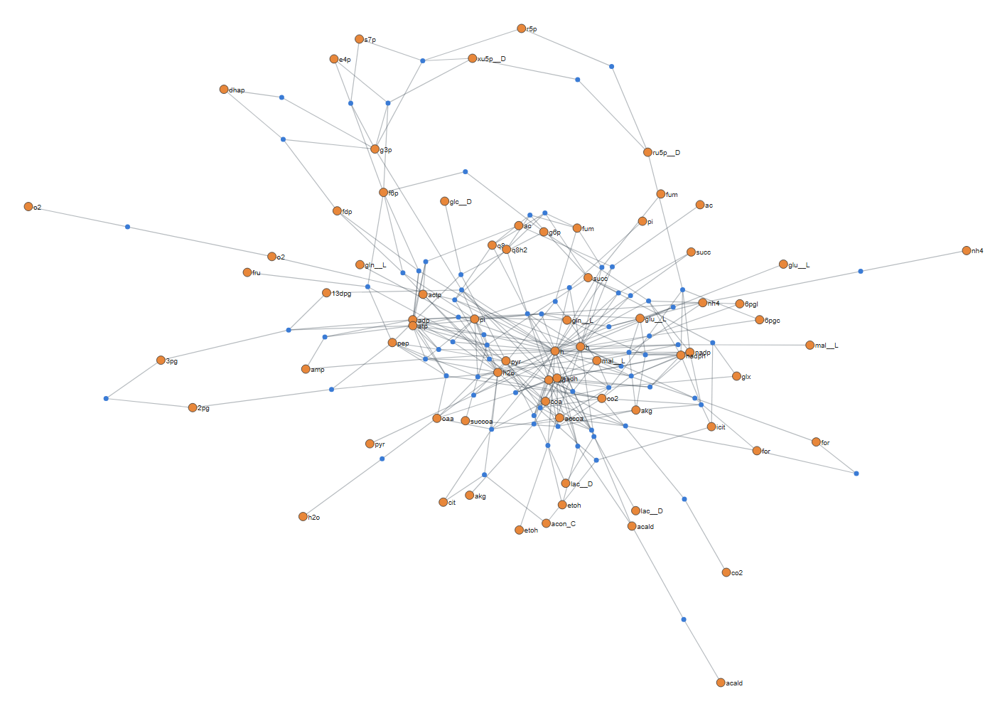
That is 95 reactions, and it’s already unreadable. The problem isn’t the algorithm, which is doing exactly what it was asked to do. The problem is the graph.
A metabolic network is dominated by currency metabolites: ATP, ADP, NAD⁺, NADH, H⁺, water, phosphate, CoA. Each one takes part in dozens or hundreds of reactions. A spring layout treats every edge as a spring, so these hubs pull every reaction toward the centre. Pathways that a biochemist thinks of as separate, like glycolysis and the TCA cycle, end up tangled together because they both use NAD⁺.
The usual workaround is to duplicate cofactors, giving each reaction its own copy of ATP. That helps, but it does not fix the deeper issue. A reaction like
pyruvate + CoA + NAD⁺ → acetyl-CoA + CO₂ + NADH
still has six neighbours, and there is no clean way to draw a node of degree six with straight, axis-aligned lines. Curators get around this by drawing something different from the graph.
Idea 1: one reaction, one edge
Look at how a curator draws that reaction. There is one arrow, pyruvate → acetyl-CoA, on the main line of the pathway. CoA, NAD⁺, NADH and CO₂ are small side arcs hanging off it.
So the first step in MetaCarto is to make that choice explicitly. For each reaction, pick the substrate–product pair that shares the most molecular skeleton, and make that the reaction’s only edge in the layout. Everything else becomes a side branch, placed after the layout is done. The skeleton comparison works from chemical formulas alone, so it needs no structure files.
There is a subtlety that took a while to get right. By raw chemistry, CoA → acetyl-CoA shares 21 carbons, far more than pyruvate → acetyl-CoA. A simple score picks the wrong pair. The fix is to treat cofactors as a separate tier rather than a penalty: a cofactor is never chosen as the main pair while a non-cofactor option exists on its side. Only when every participant is a cofactor (water transport, ion exchange) does raw chemistry decide.
After this reduction every reaction has degree two in the layout graph, and the problem becomes drawing a set of chains, branches and cycles. That is a problem graph drawing knows how to solve.
Idea 2: draw reactions in the direction they run
Models store reversible reactions in whichever direction the curator happened to type them. In BiGG, phosphoglycerate mutase is written 2PG → 3PG and phosphoglycerate kinase 3PG → 1,3BPG. That is glycolysis partly backwards. Drawn as stored, glycolysis breaks into three short chains pointing different ways.
MetaCarto runs parsimonious FBA and draws each reaction in the direction it carries flux. Pairs of opposing reactions, like PFK and FBPase, are put on the same axis instead of being left as a two-node loop.
Idea 3: layers, not springs
Once the graph is a set of directed chains, it can be drawn with a layered (Sugiyama) layout. Each metabolite is assigned a row, crossings between rows are reduced, and then x-coordinates are assigned. The method that makes long pathways come out as straight vertical lines is the Brandes–Köpf coordinate assignment. A simpler averaging method gives wobbly zig-zags instead.
Cycles get special treatment. The TCA cycle is found before layering, shrunk to a single box, laid out with everything else, and then expanded back onto a circle. The circle is rotated so that its entry point faces the pathway feeding into it.
Here is the result on the same model:
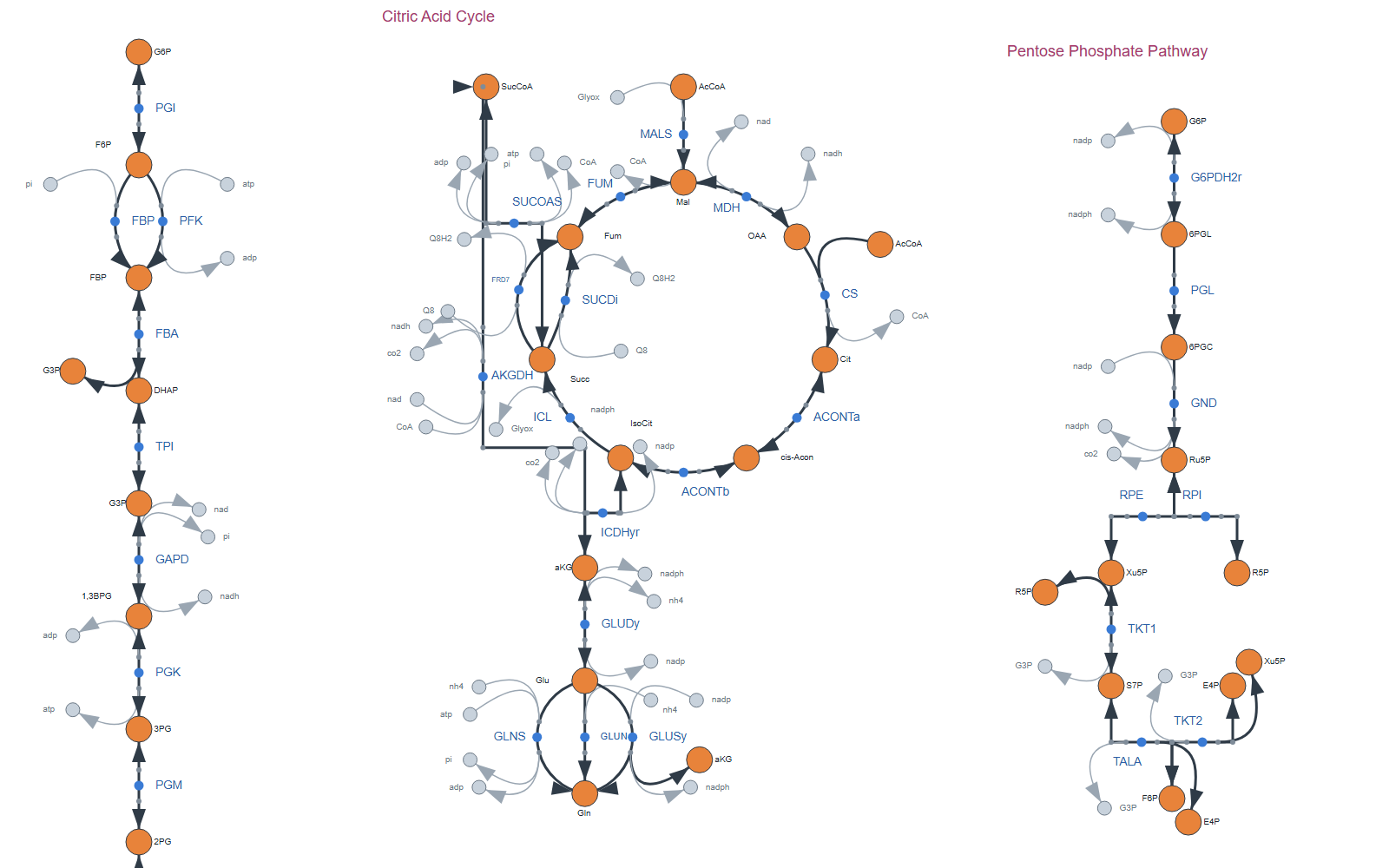
Nothing here was moved by hand, and running it again gives exactly the same picture. There is no random seed.
Scaling it up
The same pipeline runs on every model in BiGG. With MetaCarto 2 that comes to 2,764 pathway maps covering 251,140 of 251,424 reactions, plus one whole-model canvas per species. No map has text overlapping a node, a line or other text. All of them are in an Escher viewer you can open in the browser, with nothing to install:
forxhunter.github.io/escher. Use Map ▸ Load map from library… to pick any model.
It isn’t finished. A few percent of reactions still have a line passing through a metabolite they have nothing to do with, and the largest merged pages still have more crossings than I’d like. The project page lists what’s left.
Try it
The method and its evaluation against curated KEGG maps are in the preprint:
Wu, T. (2026). MetaCarto: biologically faithful automatic layout for genome-scale metabolic maps. bioRxiv. https://doi.org/10.64898/2026.09.19.752882
The code is on GitHub. It reads any model COBRApy can load, including Human-GEM and Yeast-GEM, and it can draw just the pathways or metabolites you select. If you try it on your own model and something looks wrong, please open an issue. A screenshot of a bad map is the most useful bug report there is.
Enjoy Reading This Article?
Here are some more articles you might like to read next: